
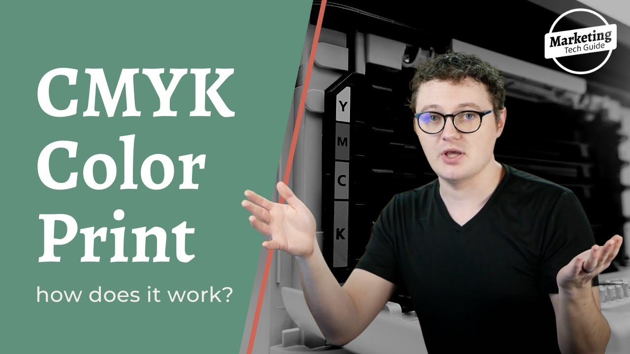
CMYK stands for cyan, magenta, yellow, and key(which means black) and refers to the ink colors used in color printing. It was first incorporated into printing in 1906 by the Eagle Printing Ink Company, where they realized the combination of those four colors could create numerous richer, darker tones.
In 1956, CMYK became standardized using the Pantone Color Matching System. It is known as a 4 color printing process, and it has the ability to produce over 16,000 different color combinations.
This system was developed to create consistent color printing for CMYK because of its large color variation. Pantone printing is very color specific and uses exact formulas of inks to create those colors, so colors are the same each time a Pantone color is printed. By using Pantone as a standard for CMYK, printing companies could implement consistent printing much more quickly.
CMYK is a “subtractive” color model meaning that the combination of the colors of cyan, magenta, and yellow create black. When creating images or marketing materials in programs such as Adobe Indesign, Adobe Photoshop or Adobe Illustrator (All part of the Creative Suite), make sure they are in CMYK format if they are to be printed.
However, if a professional learns they need an image or marketing material already created in RGB, which is a part of the “additive” color model, to be printed, the colors can be converted to CMYK. Be aware that the colors often darken and dull when converting from RGB to CMYK. With RGB and CMYK being different color models, there will be color differences between the web and print versions. They may be slight, or they could be more substantial.
CMYK is best used for full color images like photographs, whereas Pantone colors should be used for a company’s brand colors to maintain consistency across brand marketing materials. The closer the match of a Pantone spot color to the CMYK color, the better for a company since CMYK is much cheaper to print than spot colors, (usually). This can be a deciding factor when selecting a brand’s colors.